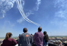
It is one of the single biggest influencers of whether a consumer will attend your air show, but it can sometimes be an afterthought for air show event organizers.
You’ve got a blockbuster performer lineup. The weather forecast is 75 and blue skies. You’ve spent thousands to market the show. You’re all set for a huge turnout. But you skimped and threw together a lackluster website. Chances are your attendance will not be what it should.
While there are shows across North America that still struggle putting together a strong website, increasingly, there are many shows that are creating professional sites that effectively sell their show, allow for easy navigation, provide useful information, successfully promote sponsor relationships, and provide an overall positive brand experience for site visitors.
We recently set about to determine what “great” air show sites have in common. To do this, we did an informal content analysis of all of the current sites of previous ICAS Marketing Awards website winners from 2005 through 2010 with the belief that these shows would have common elements that could be identified. We also reviewed a random sampling of other sites of varying show size, varying geographic areas, and both military and civilian to get a comparison. Of course, the use of the words “great”, “good” or “best” are subjective and simply relate to what we found.
What we learned is that there are eleven common elements of great air show websites and there are eleven additional tips we have included based on our observations. Generally, what we found were many commonsense things. We also found that there is usually a positive relationship between a show’s attendance and the number of elements its website had in common with the elements present in the award-winning sites. Still, there are some small shows’ websites that are similar to the “best” big sites and some large show websites that have very few similarities to the “best” sites. And, among the award-winning sites, some clear and persistent patterns developed right away. In other words, the site designers either “get it” or they don’t.
#1 Tickets
If you are an air show that relies on ticket sales for revenue, the single most important thing you can do as a show to improve your website is to make sure that you are making it easy for visitors to purchase tickets. Nearly all of the best websites have a button that appears prominently on the first page of their website that brings users to the purchasing section. Additionally, there is usually a tab or menu item that refers visitors to the ticket page. The ticket information sections of sites typically allow for an online ticket purchase. Companies such as ExtremeTix, Star Tickets Plus and others link seamlessly from the show website. Other elements within the ticket section include the ability to purchase ticket upgrades, and a listing (and often photos) of all seating options.
#2 Attractions
Of course, what makes air shows special are the performers and aircraft that drive people through the gate. And no air show website would be complete without letting visitors know who is coming to their show. While this sounds obvious, many shows struggle to promote their attractions properly.
We learned in our research that the great show sites usually use a fairly simple home page design that employs a big, bold photo of their featured performers (most often a military jet team or military single ship demonstration team). Often this is accompanied by some type of rotating animation showing multiple performers and static displays. Performer pages typically have a brief biography or description of the performer with photos of their aircraft/vehicle and often a head shot. Static display pages are usually just a list of the displays, but sometimes include photos.
#3 Schedule
Save yourself a bunch of phone calls and e-mails from fans by making sure you have a schedule posted on your site. Nearly all of the sites reviewed have some form of schedule on their site. But be careful! Most shows will not display actual performer flight times. As we know in this business, changes happen and you don’t want to promote hard times for specific performers. Most schedules are more general and, while they list times for gates opening, gates closing, and flying start and end, most simply list an approximate order of performers if they list a schedule of performers at all. Most also have disclaimers notifying fans that changes to the schedule and lineup are possible.
#4 Transportation
Most websites also have a transportation-related section on their website. Of course, you want to make sure that your fans know how to access your show. Transportation items posted on sites include maps of the air show grounds, maps of the immediate vicinity including highway access and parking, directions, tips on avoiding traffic, and information about shuttle busses traveling to or traveling on the air show grounds.
#5 Philanthropic Involvement
Does your show help support local or national philanthropies? You probably should be trumpeting that fact on your website. Many of the sites reviewed prominently display their affiliations with philanthropic organizations. This is usually done with logos and links of organizations that receive support.
#6 Sponsorships
Every show wants more of them and some shows don’t know what to do for them once they get them. While nearly every air show has a sponsor section on their website, the best sites demonstrate a similar and repeated pattern of how they promote their sponsors. Most shows have a sponsor page that lists their sponsors or shows their logos. Web tracking software shows that this page is ordinarily one of the least visited pages of an air show website. The strongest shows recognize this and try to provide additional value for their sponsor. Some of the sites choose to list some or all sponsors on every page of their site on a side bar or footer. Some sites make use of animation to display multiple sponsors on their home page or in a header on secondary pages. Nearly every site lists potential sponsorship opportunities along with an easy contact method for more sponsorship information.
#7 Volunteers
Volunteers are the lifeblood of air shows and the great show websites make it easy for volunteers to learn about opportunities and to contact the volunteer coordinator. The best sites show, either visually or through narrative, the attractiveness of being a volunteer. Some of the show sites include an online form for volunteers to register.
#8 Frequently Asked Questions
Save yourself and your event’s receptionist from having to take a bunch of phone calls and e-mails as your event approaches. Most great show sites include a dozen or so FAQ’s. Many of these answers can be found elsewhere on the site, but the FAQ section provides a central location. Have your receptionist or an intern keep a list of questions your show gets via phone, e-mail, or on social media posts leading up to the show and consider using some of those for your FAQ page.
#9 Media
Many of the best air show websites have special sections devoted to media. Specific elements of the media sections of websites include news releases, downloadable publication-quality photos, and online media credential request forms. The photos available to the media include performer and static aircraft, but also crowd photos and festival – type shots.
#10 Tips, Restrictions
ICAS survey research shows that the majority of visitors to an air show are first time visitors of that show. Providing tips and restrictions for air show fans is a helpful way to educate them about your particular show. The best air show sites have an advice page that includes such things as tips on heat-related or dehydration issues, sunscreen advice, what to wear, how to get the best photos/video, and when to arrive and depart the show. Typical restrictions listed in this section include coolers, alcohol, weapons, pets, and smoking.
#11 Contact Us
Most sites provide some method of contacting the show, although the methods used vary considerably from site to site. Some shows provid online forms. Others provide e-mails for one or several staff. Sometimes a show provides a phone number. And, occasionally, a show will provide a contact by category. For instance, a show might post “If you are interested in learning about becoming a vendor, click here.”
Bonus: 11 Bonus Tips
- Most important takeaway; be sure that your “purchase tickets” button is prominently displayed. Or, if you are free show, be sure to plaster a large “It’s FREE” prominently on every page.
- Fit your home page mostly above the fold with very little scrolling necessary. This is cleaner and allows easier navigation.
- Do not use an introductory animation or, if you must, make only limited use of introductory animation. Incorporate animation into your home page instead.
- Use bold, beautiful photography as the centerpiece of your home page and site. Whether the photos are of aircraft or of fans having fun, these are the key selling points for our industry. Use them!
- Be very careful about using audio or video on your home page. You home page should not take more than a few seconds to load. Audio and video files can slow download time and cause visitors to leave your site before it loads. Make the files clickable instead.
- Display your sponsors prominently on your home page and consider putting key sponsors on every page of the site.
- Be sure your site uses an easy, intuitive navigation system. Keep in mind that an increasing amount of your site visits are coming from mobile phones. Test your site on different platforms.
- Place links to your social media sites (Facebook Twitter, etc.) on your website. If your show doesn’t have a Facebook or Twitter page, you should (but that is a different article for another time).
- Be sure your dates are readily displayed near the top of your page.
- We found the overwhelming color of the top sites is blue and many of the sites make extensive use of white space and have minimalist, clean looks.
- Use your home page only for critical, revenue/attendance enhancing content. Be careful and insistent about not “junking up” your site.


Great article!
Comments are closed.